What makes a good Google Ads landing page?

A good Google Ads landing page gives, on its very first screen, the exact answer to what the ad promised: the service or product people searched for, the offer in the ad, and an immediate way to act, a call button or a short form. Proof, details and FAQs come further down.
Google, for its part, checks three things: that the page works, that it matches the ad and the keyword, and that it's easy to use, especially on mobile.
Most of the accounts I take over still send their clicks to the homepage. You pay $3 so that someone searching for "water heater repair Denver" lands on a photo carousel and a seven-item menu, and then you wonder why the conversion rate stalls at 2%. Here's what a landing page should contain, in what order, and how to tell whether yours is costing you customers.
What is a Google Ads landing page?
The Google Ads landing page is the page people reach after clicking your ad. In the interface, it's the ad's final URL. It can be a page of your existing site, a product page or a service page, or a page built specifically for the campaign, which is what "landing page" means in the strict sense.
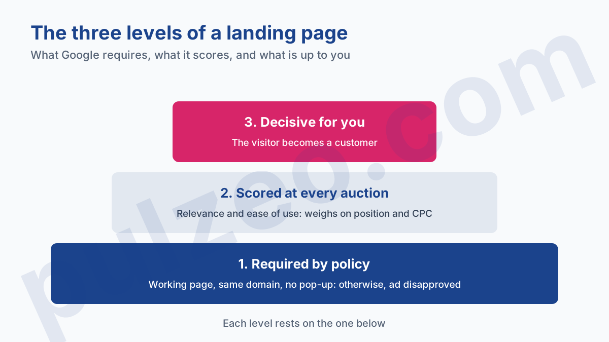
Google judges it on two very different levels, and mixing them up wastes time. There's what gets an ad disapproved, and what makes it pay more. Above both sits what turns a visitor into a customer, and there Google scores nothing: that part is up to you.
Google's landing page requirements
What gets an ad disapproved
The Destination requirements policy sets the minimum. A page that fails it blocks everything: the ad that leads to it is disapproved. Four kinds of disapproval apply to an ordinary landing page:
- destination not working: a page returning an error (404, 500) to Google's crawler, or an "under construction" page;
- destination mismatch: the domain shown in the ad isn't the one in the final URL, or that URL redirects to another domain;
- destination experience: a window that hides the content, a blocked "Back" button, a page that loads poorly in common browsers;
- insufficient original content: a page copied from elsewhere, or a bridge page whose only job is to send people to another site.
A useful nuance on banners displayed over the page. Google allows interstitials, layers shown on the page itself, as long as they don't prevent people from leaving the site. Interstitial or pop-up, a window that opens in addition to the page, the disapproval criterion is the same: stopping people from seeing the content they came for.
Landing page experience, scored per keyword
Once the ad is approved, Google keeps evaluating the page. It scores it under landing page experience, one of the three components of Quality Score alongside expected clickthrough rate and ad relevance. Each keyword gets one of three statuses, "Above average", "Average" or "Below average", based on a comparison with advertisers whose ads showed for the same search over the last 90 days.
"Landing pages with higher ratings are usually well organized and have text that relates to a person's search terms." (Google Ads Help)
Quality Score itself isn't an input in the auction, Google says so in so many words: it's a diagnostic tool. However, the quality of your ad and landing page is one of the factors in Ad Rank, measured at the moment of each search. A weak page is therefore paid for in position and cost per click, even when the Quality Score column shows nothing alarming.
What to put above the fold on a landing page
The first screen, the one you see without scrolling, has to be enough to decide. Google recommends exactly that in its guide to optimizing your ads and landing pages: put important information near the top of the page, and make it quick and easy for people to take the action you want.
On a phone, that first screen is the size of a postcard. It can't carry everything, so here's what gets priority, in this order:
- a headline that repeats the words of the search, not the brand slogan;
- the offer the ad promised, numbers included: price, timing, discount;
- one main action, visible without scrolling, a call button or a three- or four-field form;
- a short piece of proof, such as your average review rating or a certification;
- the answer to the most common doubt in your trade: service area, delivery time, shipping costs.
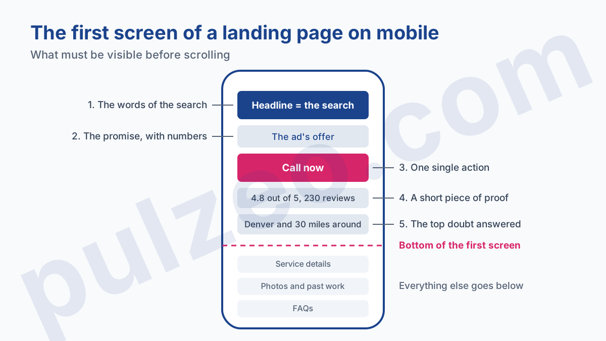
Everything else goes below: the detailed description, photos, FAQs, a second form at the bottom for people who read it all. The site's full menu doesn't have much to do there. Every navigation link is an exit door to a page that no longer talks about what the person was looking for.
The form deserves a closer look. Every field you add is one more question before the visitor gives you what you want. For a quote request, a name, a phone number and one line about the need are enough to call the person back. The full address, the size of the house and the budget can be asked over the phone.
On mobile, the phone number has to be tappable and the page has to load fast. Google gives no numeric threshold in its policy; it lists sites that don't load quickly among the reasons for disapproval and puts speed first in its mobile advice. In my experience, a page that takes several seconds to show its first screen loses visitors before they've even read it, and those clicks get paid for anyway.
Matching your landing page to your ad
This is the point that weighs the most, and the one most often missed. The person typed a search, read an ad that promised them something, and clicked for that promise. If the page doesn't repeat it right away, they feel they've walked through the wrong door, and they leave.
Google uses the example of shoes. If the keyword is "discount shoes" and the ad promises 20% off, the page has to let people find and buy those shoes with that discount. Same logic for the action: an ad that invites people to sign up for a free tour should lead to a clearly visible sign-up form.
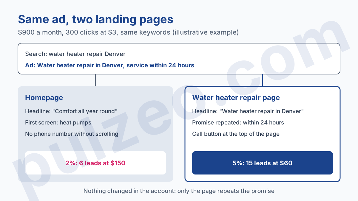
Take a plumbing company spending $900 a month, so 300 clicks at $3. Its ads, "Water heater repair in Denver, service within 24 hours", send everyone to the homepage, which talks about heat pumps first. At a 2% conversion rate, it gets 6 leads, or $150 per lead.
It builds a page dedicated to water heater repair, with the headline and timing taken from the ad and a call button at the top. If the rate rises to 5%, the same $900 brings in 15 leads at $60. These figures illustrate the mechanism; the real gap depends on the trade. But nothing moved in the account, neither bids nor keywords: only the page changed.
To redo this math with your own numbers, the conversion rate calculator starts from your clicks and conversions.
That leaves the check itself, which gets tedious on an account with thirty ad groups: opening each final URL and reading it next to the ads and keywords. Zeo, the Pulzeo assistant, can read the landing page of your active ads and tell you whether it repeats the keywords and the promise of the ads that lead to it.
Do you need a dedicated landing page for Google Ads?
Not necessarily. You need a page that matches the intent of each ad group, and on many sites it already exists. A good service page or a well-filled product page often does better than a generic landing page thrown together in a hurry.
I build a dedicated page in three cases. When no page on the site covers the ad group's topic precisely. When the campaign's offer only exists in the ad, a discount or a free trial for instance. And when the existing page can't be edited, because the site depends on a network or a platform that won't give you control.
On the other hand, one page per keyword, advice you still come across, is rarely a good idea for a small business. Ten near-identical pages are ten pages to maintain, and a risk of disapproval for insufficient original content if they only differ by one word. One page per intent is enough: repair, installation, maintenance.
How to tell if your landing page is holding your ads back
The first signal is in the account. In the keywords list, add the "Landing Page Exp." column, found next to Quality Score in the column picker. A "Below average" status on your highest-spending keywords points to the page to rework first; how to read all three components is covered in the Quality Score article.
The second signal is the conversion rate per page. If two comparable ad groups convert at 6% and 1.5%, and only the page differs, you've found your culprit. Before concluding, check that conversion tracking works on both pages: a missing tag drops the rate to zero without a single visitor changing their mind, a trap I cover in the guide to misconfigured conversions.
Finally, keep in mind that a rising rate doesn't always mean more sales. Excluding useless searches pushes the percentage up without adding a single customer, while a better page really adds some. The difference between the two is explained in the article on improving your conversion rate without losing sales.
Where to start
If you were to do just one thing this week: open, on your phone, the final URLs of your three most expensive ad groups, next to the ad that leads to each one. Read the first screen like someone who has just typed the search. Do they see what they were promised, and a way to act without scrolling? If the answer is no, you know which page to rebuild first.
This check takes ten minutes, and almost nobody repeats it after launch, even though sites change: a redesign, a new cookie banner, an expired promotion still written in the ad. Pulzeo pulls Quality Score and its three components for every keyword, and Zeo can list, whenever you ask, the ones whose landing page is rated below average, so you know which page to read first.
A landing page has one job: to prove in a single screen that the click was the right one.
Common questions
What's the difference between a landing page and a destination page?
In Google Ads, none: both mean the page people land on after the click, the ad's final URL. In everyday use, "landing page" often refers to a page built specifically for a campaign, with no menu and no goal other than the conversion. Google judges a dedicated page and an ordinary page of your site the same way.
Can I send my Google Ads traffic to the homepage?
Nothing forbids it, and the ad will be approved if the page works. But the homepage talks about everything, so it rarely talks about what the person just searched for. It holds up for searches on your brand name; for a service or product search, a page that covers exactly that topic almost always converts better.
How many landing pages does a Google Ads campaign need?
One per intent, not one per keyword. If a campaign covers the repair, installation and maintenance of the same equipment, three pages are enough, one per ad group. Multiplying near-identical pages makes maintenance heavier and exposes you to disapproval for insufficient original content.
What should I do when landing page experience is below average?
Start with the keywords that spend the most with that status, then open their final URL on a phone, next to the ad that leads there. In the vast majority of cases, the page doesn't repeat the words of the search or the ad's promise, or it loads slowly on mobile. Fix those points before you touch your bids.